Textivalkrant
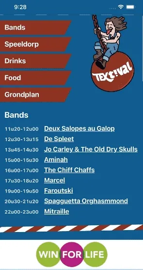
A mobile program guide with a funny twist

For a local festival I was asked to make some kind of digital program guide. There was a focus on reducing the amount of print, so a dedicated mobile site for the schedule and other useful information was a logical approach.
To keep the sponsors happy, they also had to be given some exposure there. The problem was: how to display more than 20 sponsors on a mobile site? No one would sit back and swipe to a carousel of sponsors.
Butt crack
The theme of the festival was ‘construction’ and low hanging pants was already been mentioned a couple of times. So I came up with the idea of hacking the mobile page refresh. Instead of refreshing the page, one would pull down a construction workers pants and a new sponsor would pop up.
The pull down hack was implemented quite easily. Off course there were some differences between Android and iOS, but they were easily resolved.

Probability
To decide which sponsor would pop up, I wrote a serverless function that returns a specific sponsor, the higher they sponsored, the bigger the chance they will be returned.
I based the algorithm on this genius piece of code. I don’t entirely grasp how it works, but it does…
Sponsor logos
Everyone that had to publish something with lots of sponsors on it gets it: all those logos with different colors, orientations, and dimensions are terrible to work with. I wanted them all to be at the bottom of the screen, like a banner. But that meant that I had to get them within the same dimension, pick a background color, center the logo and so on. And when it would turn out that they needed some more padding, I would have to do it all over again. I don’t think there was any extra motivation necessary to script this job.
The result
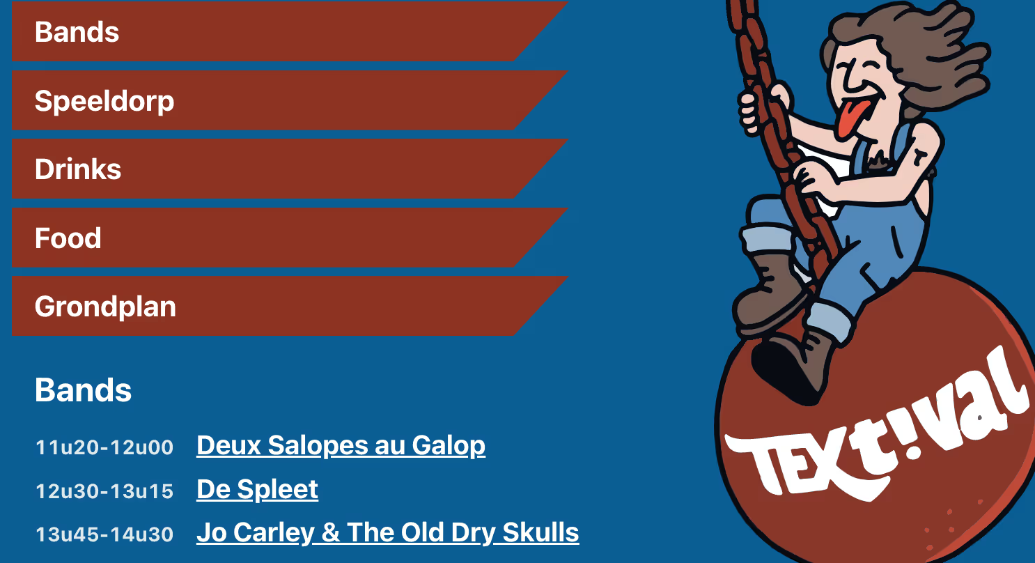
You can have a look at textivalkrant.vercel.app but be aware it was meant to be viewed on a mobile device. People scanned QR codes that were on the tables.
Credits
I can’t finish this post without giving credits to Pieter Depoortere and Agata Smok for the graphics and style guidance. Go check them out.